MARKETING & DESIGNING PRINT ADVERTS: A GUIDE FOR CREATIVE FREELANCERS

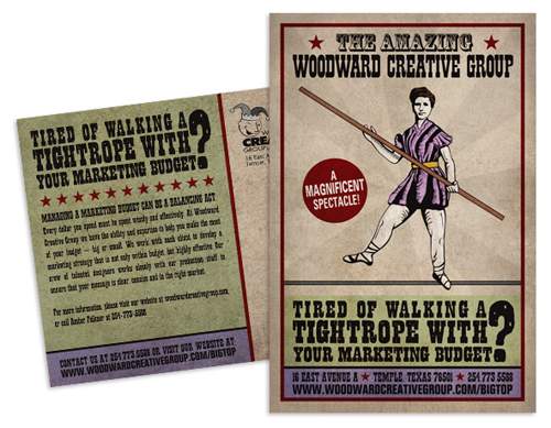
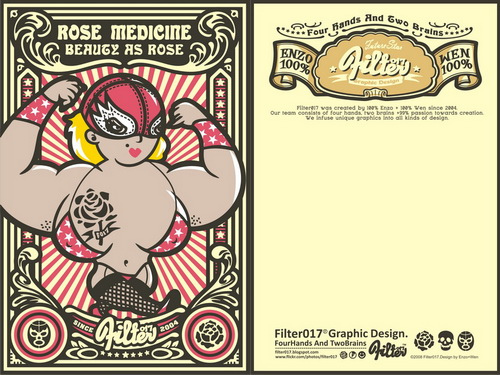
Most people who work in a creative industry understand the importance of marketing one’s products and skills in an effort to attract potential clients and sponsors. One thing you can do to gain exposure as a Freelancer Artist, Designer or even Blogger is to directly send or hand out feelers in the form of print adverts. These feelers act as a sort of mini resume or portfolio. I personally have visited numerous art shows and websites solely because I was sent or came across a well designed and thought provoking brochure or postcard. Today I have decided to share with you some simple tips for designing and marketing print adverts, which will hopefully have potential clients and sponsors calling you.
 Brochure printing and postcard printing and the design process involved needn’t be time consuming or something to stress about. If you follow these tips and tricks you should be well on your way to designing and marketing something great.
1. Determine your goals and audience:
What are you offering? Who are you offering it to? How do you want this person to react? These are all questions you need to ask yourself before putting pen to paper or opening Photoshop. The most important thing to consider when it comes to selling something, whether it be your services, an event or product, is your audience and what you want to achieve. As a creative freelancer your want your adverts to not only reflect your skills and experience but to grab enough attention so that a potential client is inclined to look deeper into what you are offering. Once you have determined your audience and goals you should have a pretty good idea of your adverts direction.
2. Determine the concept of your design and the content to be included:
Now that you have determined your target audience and your goals it’s time to focus in on creating a suitable concept. Start brainstorming, whether you use a mind map, sketches or notes start jotting down your ideas and collecting inspiration. When it comes to marketing yourself you only have one chance at making a good first impression, so the overall feel and impact of you advert is of the up most importance. Your design concept should be thought provoking, memorable and grab the attention of the reader. Think carefully when developing ideas and evaluate the impact they will have from various perspectives. When brainstorming keep in mind the content you would like to include in your advert, as this will allow you to determine what kind of advert you will need to create, whether it be a simple postcard or a multi page brochure. Some things to consider including in your design are; photographs, logos, contact information, slogans and customer referrals.

3. Start Designing:
Now it is time to start designing. Use your initial sketches or brainstorming ideas to draw together all the components you wish to include in your advert. Be sure to take into account the following;
- Make sure that any images or photographs that aren’t your own are sourced legally and licensed for print publication. Note that some graphics and photographs purchased online may require an extra fee if the image is going to used in print rather than just on the web. Do your homework first to ensure all licencing is up to par.
- Be sure that your design and text suit your desired audience. A quirky, colourfully designed postcard will most likely be perceived well at an Indie Publication but a serious Financial Magazine perhaps not so much.
- Ensure that the message you wish to portray is done so clearly, without any room for misinterpretation. I like to ask a non-bias friend who has no idea what the subject matter is to tell me what she/he believes the advert is all about. Something I have learnt the hard way is that just because a concept is clear to you doesn’t mean it will be to others. Always ask for input from an outside source/s.
- Make sure that your design reflects your personality. After all it is your product or services you are offering and your adverts are a reflection of this. Having said this don’t deliberately exclude certain clientele by being too specific in your style or design. Attempt to display a broad range of skills while maintaining your personal style.
- Ensure you don’t go over the top with your design. Over-designing can leave your final product looking busy and unprofessional and often the message you are trying portray is overshadowed by all that glitter and jazz.
- Ensure your text is clear and legible. A potential client or sponsor is likely to become frustrated and disregard your advert if your email or web address is barely visible or discreetly intertwined amongst mountains of images and graphics. Keep text simple and easy to read. Like a cover letter, clients or sponsors want something that showcases your skills while being straight to the point.
- Most importantly ensure your concept and design leave the reader wanting to know more . I good advert will have the reader feeling inclined to visit your website or blog or better yet contact you.

4. Print & Distribute:
Now that you have your final design sorted it’s time to get your adverts printed and ready for distribution. Printing adverts can be quiet expensive, but I like to think of them as an investment. With any investment you want to be sure you are making good use of your money. Having your adverts printed from an online company is usually the cheapest method, however, if you are unsure what’s to offer in your area a quick Google search usually helps or better yet ask in a design related forum for some recommendations.
Because of the expense of printing and distribution it’s important to ensure that your adverts are being received by your targeted clientele. Look into potential clients and sponsors carefully and mail your feelers to the correct department within that company or organisation. Steve in accounting is not going to give two hoots about your freelance graphic design skills and chances are he’s too busy to pass your advert along to someone who does, leaving your hard work and money in a recycle bin somewhere. Be smart and do your homework first. This will save you a lot of time and money.
If possible distribute your flyers or postcards in person. Not only can you be certain that your adverts are reaching the right person, the potential client or sponsor is more likely to remember you when looking for candidates for a project at a later stage. Leaving your brochures at public places frequented by your desired audience is also an option when it comes to distributing your adverts. For example if you are a freelance illustrator it may be a good idea to leave your brochures or postcards at the counter of a coffee shop frequented by independent writers. Be smart and carefully consider your distribution methods, 20 well thought out submissions will be far more effective than 100 adverts handed out willy-nilly.
So there you have it, a quick and straightforward guide to marketing and designing print adverts for the creative freelancer. If you have any tips of your own or would like to share your own designs feel free to comment below.
Tags: Design, Designing Print Adverts, Freelance, Freelance Marketing, Marketing, marketing and designing print adverts for freelance creatives, Print Adverts, tutorials
 Have fun with this tutorial and be sure to comment to let me know what you think.


