Archive | Tutorials RSS feed for this section

Photoshop Tutorials

3 Aug

TUTORIAL: CREATING CIRCULAR IMAGES IN PHOTOSHOP

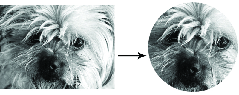
Pappi! round

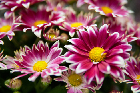
Using circular shaped images or graphics in a design, on your blog or within various social media platforms has quiet an eye catching effect and because of this is a great way to draw attention to your content and a useful skill to have. Cropping any shaped image into a circle is really simple to do and can be done by following these 6 simple steps:

Circle images in photoshop

** THE STEP BY STEP **

Arrow

1. OPEN YOUR IMAGE IN PHOTOSHOP

First you will need to open your image in Photoshop. I edited the above image before cropping it. I find it a lot easy to do this before any cropping and recommend you do the same. Also be sure that any images are flattened before you begin any cropping/clipping.

2. SELECT THE ELLIPTICAL MARQUEE TOOL

Now you will need to select the Elliptical Marquee Tool from the toolbar. Ensure that the Feather Value in the top toolbar is set to 0px,  the Anti-Alias is checked and Style is set to Normal.

3. DRAW YOUR CIRCLE 

Holding down the Shift key drag your cursor to create a circle of your desired size. Use the Move tool (V) to position your circle perfectly.

4. REMOVE ANY EXCESS BORDERING

Whilst you circle is still selected click on Image then Crop. This will get rid of the any excess background area and create a square shape (providing your circle is completely round).

5. DELETE THE BACKGROUND

Double-click on the Background in your Layers Palette to turn your image into a free-floating layer. Leave the values at default and select OK. Now you will need to add a Vector Mask which will cause the area outside the circle to become transparent. Do this by Selecting the Add vector Mask Icon (it looks like  rectangle with a circle in the center) in your Layers Palette and you’re done!

6. SAVE YOUR CIRCULAR IMAGE

Be sure to save your image as a PNG if you wish to keep the background transparent. Other formats like JPEG will automatically fill such background white.

& you’re done!

Arrow

So there you have it a super easy method of creating circular shaped images in Photoshop. I hope you have enjoyed this tutorial and be sure to check out my others here. . Also, if you have any questions regarding this tutorial or any of the others free to comment or message me with them. I also take requests so if you’re curious how to do something let me know!

Signnn

SEO basics for Bloggers

12 Jul

BLOGGING & SEO WHAT’S THE GO?

HOW TO MAKE YOUR BLOG SEO FRIENDLY

Blogger Guide to SEO friendly ContentWHAT IS SEO & WHY IS IT IMPORTANT?

SEO is the abbreviation for Search Engine Optimisation. SEO affects your websites and it’s corresponding pages visibility in search engines like Google.com. The better your webpages SEO the higher it ranks in search engines and the more likely it is to appear in the first few pages of a search and be clicked. This means more traffic to your blog! As a Blogger you want your content to be found, read and shared and having a blog with SEO friendly content that drives traffic from search engines is the key. Now that you understand what SEO is and why it’s important, it’s time to get started on making your blog and posts SEO friendly using these basic SEO techniques.

** MAKING YOUR BLOG SEO FRIENDLY **

Arrow

* LINK BACKS

If you want to get your blog or webpage listed in search engines as soon as possible (beat the crawlers) getting your URL listed on a high ranking webpage is the key. If such webpage is using some of the same keywords as you do/intend to it’s a bonus! So if you have a friend with a high ranking website or blog ask for a link. You can also purchase ad space on certain websites or blogs or offer free link exchange.

* HEADER TAGS

 Header tags look like the following: <h1> <h2> <h3>. When adding a title or subtitle use your header tags rather than a picture. If you include the first three H-Tags ( H1, H2 and H3) in your post you’re doing well. If they happen to contain your keyword/s that’s excellent. I try an include at least a descriptive <h1> tag within each of my posts.

* KEYWORDS

Keywords are a particular word or phrase that describes the contents of a web page/blog post. The word/s in which people use to search for particular content in a search engine. With this post for example, I may choose to you use a keyword or keyword phrase like the following: “Blogging and SEO” “SEO for Bloggers” or just “SEO”. It’s important to determine what keyword or keyword phrase you want to include within your posts/web content before you begin writing. Be aware that more popular/simpler keywords or keyword phrases (like SEO) are more commonly used and harder to get indexed in a position where they would be found. Because of this it’s best to choose something less popular or direct like “SEO Basics for Bloggers” and focus on getting your content indexed using that keyword. Once you have determined your chosen keyword/s or phrase concentrate on including it within your content. Try not to go overboard and use your keyword/s in every second sentence. You want your keywords to flow organically. Plus people want to read your content not a bunch of keywords ( or H-tags for that matter). Position of your keywords is also important. It’s best to try and include your keyword/s within the first sentence of your first paragraph and the last sentence of your final paragraph. You can also scatter them through out your content and include them within image titles and captions (see next step).

* BE DESCRIPTIVE

Use descriptive titles, subtitles, photo captions, photo titles, post categories, URLS and post tags that include your keyword/s or phrases. Don’t upload a photo or image with a title something along the lines of “zxcqjhdudi”. Add a descriptive title that either describes the image or the post in which it is featured. This also a great habit to get into especially if you want people to share imagery from your webpage to sites Pinterest or WeheartIt. An image titled ”zxcqjhdudi” doesn’t look all that professional and as most people don’t bother to manually change this, when the image is later found its’ context unknown and less likely to click on.

* LIMIT IMAGES

Use html to alter text, add borders, line breaks etc. instead of including an image. For example if you want to include a coloured title, do so using html not by inserting an image created in Photoshop or Illustrator. Limiting the amount of images will also make your pages load quicker. Research has shown that if a website takes more than 4 seconds to load over 1/3 of people will not continue to wait. You don’t want that!

* LINK CONTENT

Add links to other content or  pages within your current posts. You can do this by referring to a past post in text, inserting a related posts widget or a little footer note like “If you enjoyed this article you may like link, link or link.”

* ENCOURAGE SHARING

 You can easily do this by including Social Media sharing buttons within each post. Most themes already include these, but if yours doesn’t to you can install a Plugin (25 examples) or manually add each button/link in html. My favourite Free Link Builders for Pinterest (official) and Twitter, Facebook and Google+
Arrow

These are just the very basics of creating a SEO friendly blog and content that will hopefully have you on the way to a creating regularly indexed and clicked search engine content. If you have any questions or tutorial requests feel free to comment below. I’d love to answer your questions and hear your post suggestions.
Signnn

If you enjoyed this article you may like: “Finding motivation to achieve your goals“.

Creating your own Textures in Photoshop

7 Jul

CUSTOMISING TEXT IN PHOTOSHOP USING YOUR CUSTOM PATTERNS

Create patterned text using photoshop patterns Creating your own custom made Photoshop patterns is a great skill to have. Especially if you are having trouble finding something particular online or don’t feel like paying for it. In this tutorial I will not only be showing you how to create and save your very own custom Photoshop patterns but how to use them to create patterned text. Like that seen in the image above.

** THE STEP BY STEP **

Arrow

1. CREATE YOUR TEXTURE

The first thing you need to do is create your texture. I decided to create a simple lipstick mark collage using these free photoshop brushes. To get started I created a new document with the following dimensions: 1500px by 1500px. I intended on using my pattern for large text (seen above) so used a very large canvas and larger graphics. If however, you intend to use your pattern for a smaller font you will need to create/use smaller more condensed graphics but can use a smaller canvas. Next up I rendered my background a slightly off white ( EDIT + FILL -> Select your chosen colour). Then using my Lipstick Brush Tool stamped across my canvas, switching the sizes, colours and positions of the brushes until I had my desired effect. I then flattened my image into one layer (LAYER + FLATTEN). 

2. SAVE YOUR TEXTURE

Now that you have your desired image you will need to save it as a texture. To do this simply click on the EDIT tab and select DEFINE PATTERN. You will then be prompted to name your pattern. Do so, click OK and you’re done! Now you have your very on custom made Photoshop texture ready to use.

3. ADD YOUR TEXTURE TO TEXT

On a new canvas or layer add your text using the HORIZONTAL TYPE TOOL. Resize and position your text until you have your desired effect. Now right click onto the text layer in the LAYERS TAB and select BLENDING OPTIONS. Check the box that says PATTERN OVERLAY. You can now select your pattern from the drop down box to the right. You can keep the other pattern overlay options at default or play around with them until you get your desired effect. Click OK once done. If you didn’t create a new canvas, rather a new layer simply turn off your background layer by unselecting the LAYER VISIBILITY icon. Now your text should fully rendered using your own custom made pattern and you’re free to play around with it’s position as well as various other text effects.

Arrow

I used CS6 to put together this tutorial. If you happen to have an earlier version you should be able to follow along fairly easily. Your interface however, may be arranged a little different to mine, so the location of certain tools may be differ. If you have any concerns just leave me a message below I’ll do my best to help.

Please note that this is a very basic method of creating a Photoshop Pattern. If you are looking to create something more professional, that can be tiled or stretched there’s a bit more work involved within the first step. I am willing to create such a tutorial if requested. Just let me know!

I hope you have enjoyed this tutorial and if you have any questions of requests feel free to comment below!
Signnn

Tutorial: Simple Selective Colouring in Photoshop

3 Jul

SIMPLE SELECTIVE COLOURING IN PHOTOSHOP

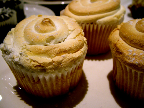
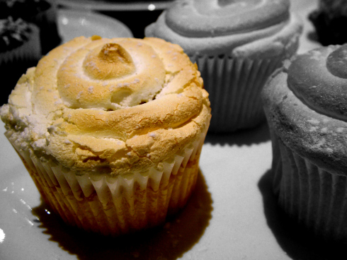
Selective Colouring in Photoshop is a simple technique to learn. I have created a easy to follow step by step tutorial depicting how to do so on my Jux Blog. Click here to view it.

THE ORIGINAL IMAGE: 

THE FINAL IMAGE:

If you have any questions or tutorial requests feel free to ask. I am happy to oblige!

Signnn

Tutorial: Creating a “Light Glow” effect using Photoshop

2 Jul

CREATING A LIGHT GLOW EFFECT IN PHOTOSHOP

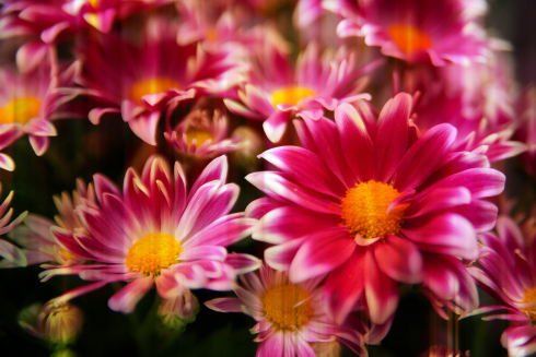
Creating a “Light Glow” effect in Photoshop is not only insanely simple but has the ability to greatly enhance any of your digital images. Once again my full tutorial has been posted to my Jux account. To view it Click Here.

THE FINAL IMAGE:

THE ORIGINAL IMAGE:

If you have any questions regarding this tutorial or any of other my tutorials feel free to contact me. I also take requests so don’t be shy!

Signnn

Follow

Get every new post delivered to your Inbox.

Join 6,295 other followers