10 GREAT MINIMILIST STICKER DESIGNS
Stickers are used as a marketing tool by hundreds and thousands of companies around the world and when used well, they can be extremely effective. Not only is it a marketing exercise, but it is also a branding exercise as stickers tend to end up in the most unlikeliest of places.
There’s certainly no shortage of stickers around, but truthfully, a lot of these stickers are pretty grim and boring. The ones that really stand out tend to be quite minimal and use only a few colours, fonts and imagery.
So, if you’re looking to design a sticker for your business, you might want some inspiration. Here are a few great minimalistic sticker designs.
#1 - Popset
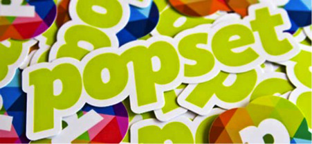
Popset is a fantastic iPhone/iPod application that allows you to quickly create amazing looking photo sets from the photos that you have taken. Obviously, there’s a lot of competition in the App Store these days so getting your particular brand/app out there is key. Popset incorporated these minimal stickers into their marketing strategy to help get their brand message out there.
Source: Popset
#2 - Coast2Coast
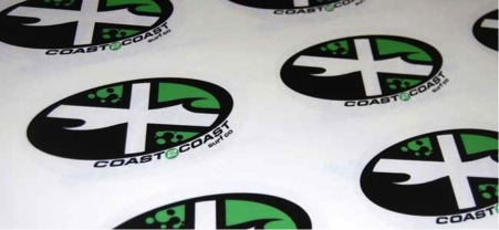
These stickers for Coast2Coast; a surf company based in the UK, were produced to raise awareness of the company amongst surfers. They’re very minimal (using on green, black and white) but also very bold and stand out a mile off. Many surfers that chose to stick them on their surfboards, thus raising awareness of the brand amongst their target audience.
Source: www.discountbannerprinting.co.uk/stickers/stickers-labels/
#3 - Dribbble
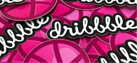
Any regular Dribbble users will know that their logo is essentially made up of two parts. There’s the pink globe and the actual “Dribbble” text. In more recent times, Dribbble has opted for only showing their text logo, but the pink globe still remains as a favicon on the website. These stickers from Dribbble are basically the two parts of the logo; the pink globe and the Dribbble text. Very minimal and simple, but effective.
Source: Dribbble
#4 - Givespark
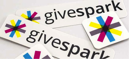
Givespark hasn’t even been launched yet but this just goes to show, stickers are an essential marketing tactic for getting your branding and message out there, even prior to launch. Givespark will be a place for celebrities and fans to gather and their stickers are simple; it’s their logo. Luckily, their logo is also minimal and is a quite similar (at least colour scheme wise) to LivingSocial.
Source: Givespark
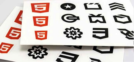
#5 - HTML5
HTML5 is quickly taking over the wek these days, but in the early days, it had quite a lot of competition with Flash. Sure, a lot of web developers are now realising the benefits of HTML5, but it is still sighting the web video war and these stickers are definitely going to help raise awareness. Simplicity is the key here as many of the stickers use only black and white while the HTML5 logo uses orange and white.
Source: HTML5
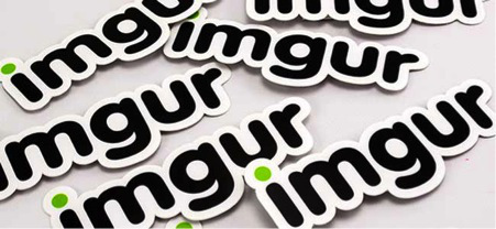
#6 - imgur
You’ve probably come across imgur before but if you haven’t, it is essentially a photo sharing website that has some pretty amusing photos. These imgur stickers were no doubt used to market the company and their design is very minimalistic. The stickers use three colours, black, white and green and simply show the website logo.
Source: imgur
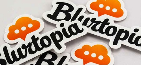
#7 - Blurtopia
Another iPhone/iPod app now in the form of Blurtopia. Blurtopia is essentially a fun app that allows you to answer the questions you might have on a day-to-day basis as you go. It’s a free app and has been becoming increasingly popular in the iTunes app store. These minimalistic stickers simply show the logo and were used to increase brand awareness. The only two colours used are white and orange.
Source: Blurtopia
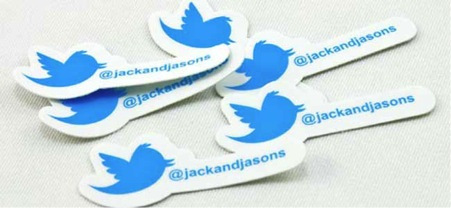
#8 - Jack & Jasons
A lot of businesses use Twitter, but very few of them really market themselves on Twitter and promote their accounts to potential followers. However, Jack and Jason’s; a pancake and waffle company based on the west coast of the USA, did just this and produced stickers that promoted their Twitter account. The stickers were very minimal and simply used the Twitter logo and account handle. They didn’t incorporate any company branding at all.
Source: Jack & Jasons
#9 - Ember
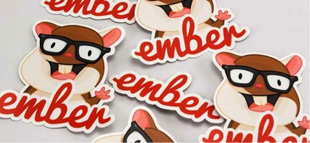
Ember is essentially a geeky piece of code that allows web developers to utilise a framework for their ambitious web applications. Believe it or not, web frameworks are plentiful so in order to stand out from the crowd, Ember utilised stickers as part of their marketing plan. Ember produced two stickers; one of their logo and one of their “mascot hamster”. They both help to raise brand awareness and are both clean and minimal.
Source: Ember
#10 - Nyan Cat
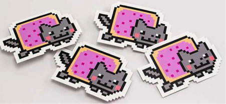
Nyan cat is an internet sensation with hundreds of millions of views. Although it might not need stickers for marketing purposes, there are a lot of Nyan cat fans as the internet sensation has become popular around the world. So, Nyan cat produced some stickers..of Nyan cat. They’re no doubt worn by hundreds and thousands of fans around the world and essentially, are nothing but a picture of the Nyan cat sensation. Very simple and minimal.
Source: Nyan Cat
Author Bio: Josh is a marketing enthusiast and currently manages to social media accounts for DBP, a UK based printing company. He loves design, marketing and advertising and believes that a minimalistic approach is key to success these days.
(* This is a Sponsored Guest Post)




So cute stickers! i wish i had one. <3
#giglove
XO,
icy
http://icyencinas.blogspot.com/
Thanks Icy